Wunderkind
A school desk interface designed to meet the needs of all students regardless of their abilities. The public education system in the United States of America works under the idea that there is only one type of student and one way of learning. However, all students learn differently due to behaviors, personalities, and abilities. This often results in kids falling behind if their educational needs are not met. This new desk interface creates a unique learning environment for each student while maintaining a classroom setting with peers. The final outcome is a fully functioning school desk interface that allows students to learn with tools best suited for their individual needs. The goal was to make learning for students with disabilities easier and enjoyable.
Institution
Temple University, Tyler School or Art and Architecture
Art Direction
Abby Guido
Deliverables
UX/UI
Branding
Advertising
The Plan
To create a desk with a simple digital interface that has preset tools for each student to meet their learning needs. They will all have their own specific tools on their desks while maintaining a classroom environment with their peers and teachers.
Process
Formative Research — The Problem
Students with disabilities or education struggles often have to take classes away from their peers. Many also struggle to understand lessons and can fall behind. This leaves many students feeling isolated and can infringe upon their learning and future success.
The people represented in the user personas are the students, teachers, and parents. The are the individuals most involved when a child is diagnosed with a learning disability.
User Personas
Primary Research
Overall Statistics
2.3 million students are diagnosed with specific learning disabilities in the United States of America. 35% of those students have special education plans while 75% - 80% of them have deficits in language and reading. Along with this, one million+ students with Individualized Education Program (IEP) miss three or more weeks of school a year. Children with learning disabilities are more likely to want to stay at home due to stress and are three times as likely to dropout.
Issues Students with Learning Disabilities Face
Children with learning and attention disabilities are more likely to fall behind which can impact their self esteem and learning. Many experience anxiety and stress from school that non-learning disabled students do not feel. Students with learning and attention disabilities also often feel less accepted by peers and have a higher chance of being bullied.
Potential Problems
The Teachers’ Needs and Abilities:
Teachers may have trouble learning how to use the desk depending on their technological abilities.
The Nature of Learning Disabilities:
Having a screen in front of students may allow them to get more distracted. if the interface design is overly complicated, it could be confusion for users as well.
Wunderkind: a person who achieves great success when relatively young
Design
Initial Logo & Name Options
While the initial names succeed in sounding education related, many were too difficult for children to pronounce. Others were already used by other companies and could not be included in the design.
Final Choice: Wunderkind
Wunderkind means a person who achieves great success when relatively young. This best reflects a learning brand made for children and promoting success regardless of abilities. Wunderkind also has a friendly and whimsical feel as well.
Sketches brainstorming initial name and logo ideas
The Final Logo
The logo is simple and clean to promote readability and accessibility. The icon is an elephant to appear friendly to children and also represents knowledge and wisdom. Below are the secondary logo and icon.

Style Exploration
Style Tile
Focus was placed on colors that stood out and had contrast so they were easy to see and read. Consideration was given to accessibility and the needs of color blind students who cannot tell the difference between certain colors as well as those who benefit from reading on a darker background.
Colors: The colors chosen work on both dark and light backgrounds and meet accessibility standards. The light background color is an off white instead of pure white so there is less strain on the eyes.
Buttons: The buttons are big and use colors that are not anywhere else, making them easy to identify as an action to get to one point to the other. The yellow buttons are for navigation and the orange are for getting help.
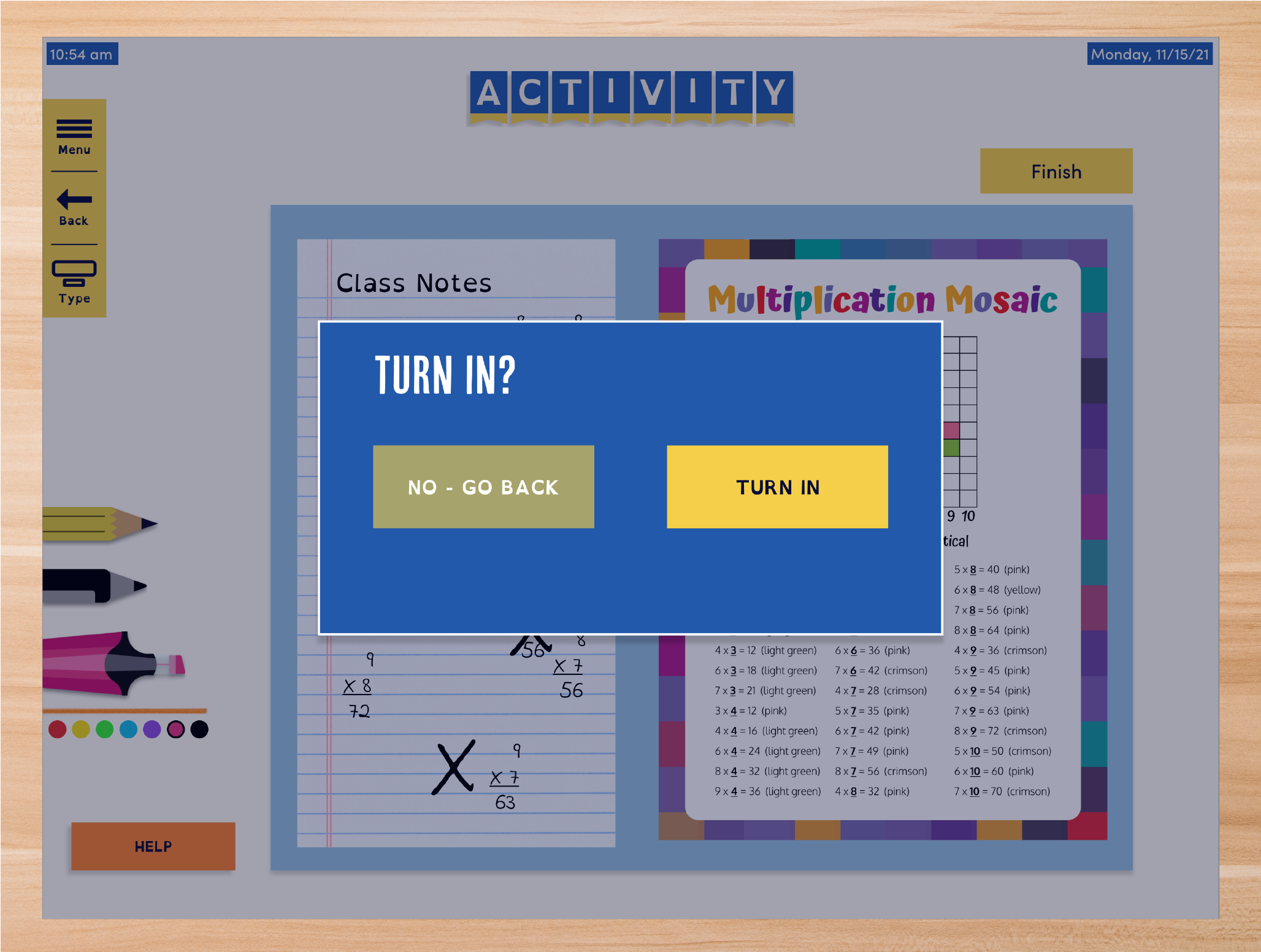
Writing Tools: The desk has tools for taking notes, highlighting, and doodling to help with focus. This gives students all the items they would normally have with physical supplies but contained within one stylus.
Fonts: Various fonts were included to give students options to use. There the standard fonts as well as accessible fonts like OpenDyslexic that is designed specifically for people with Dyslexia to use.
Illustrations
The illustrations were inspired on children’s books as kids often spend time reading and find the art familiar. I focused on lots of colors, shapes, and simple textures. It had a friendly and whimsical feeling to relate back to the logo and overall approach to interface.
Low Fidelity Wireframe
The initial layout for the desk interface before the style tile’s designs are added to it. The information is blocked out and is focused solely on layout and considering what elements are needed or not.
Overview of the Wireframe
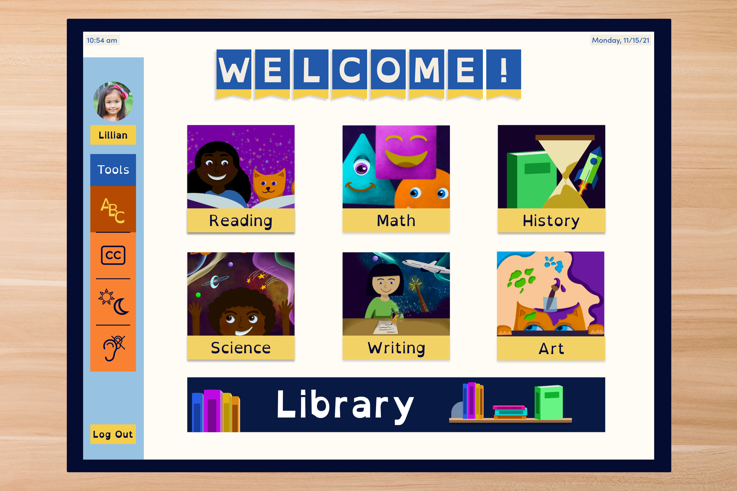
The screens start off with a simple log in screen that opens to a homepage. Here students can find classes, their profile, and the accessibility tools they use.
Through the home screen, students can find a page for each class where they access their agenda holding assignments, lessons, and educational activities
A library is included as well so students can access books, ebooks, audiobooks. This allows them too use whichever form of reading fits their needs best.
Other details include a page for students to track their upcoming tests and homework for the night with their parents being able to see it on their own interface at home.
High Fidelity Wireframe
High Fidelity Wireframes with light and dark background
Problems and Changing Directions
Overcomplicated Design
While my initial designs started off with many accessibility tools available for students to turn on and off, the discussion of how distracting this would be came up.
I originally designed the desk to give students access to everything like grades, and a calendar. This made the interface complicated and more like a device for older students in high school and college.
How I Changed Directions
To fix the issue of the accessibility tools being distracting, I changed the design so the tools are only found on the homepage. This keeps them in reach but not constantly on the screen.
I simplified the interface design and focused only on the classroom learning aspects of education. This resulted in access given only to classes, assignments, an agenda book, library, and educational games.
Final Deliverables


Conclusion
This project was rewarding as I have a learning disability and know many others who do as well. Through this I realized that there are ways to design with the purpose of solving an important issue. I also learned it is difficult to meet the needs of every individual. However, starting off with a smaller focus creates solutions to other challenges. I would like to push this project more by meeting the needs of all students with different abilities and design a system for parents and teachers to use as well. Working on this project was a rewarding experience and allowed me to think about design as a solution to complicated problems.